eisai oncology
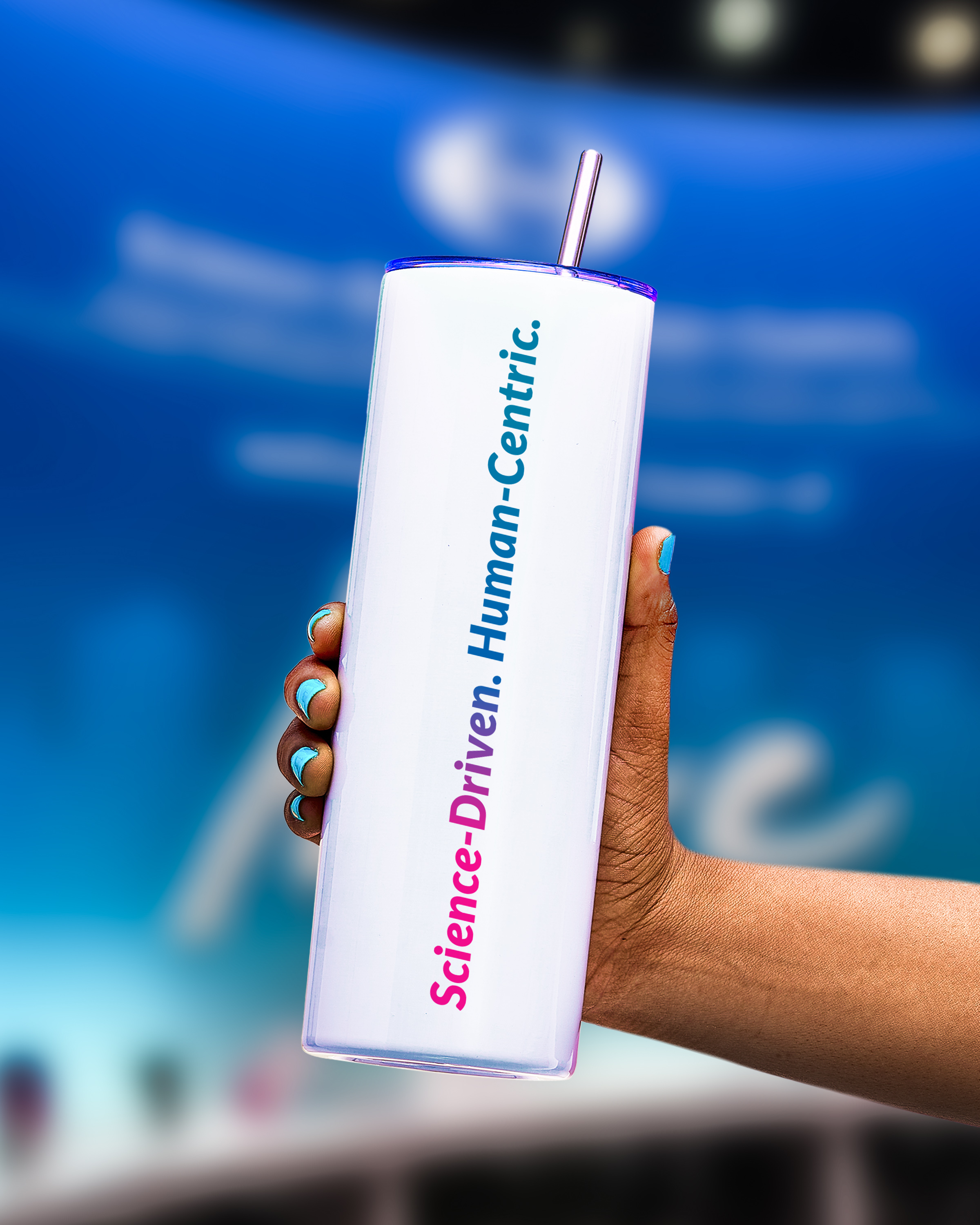
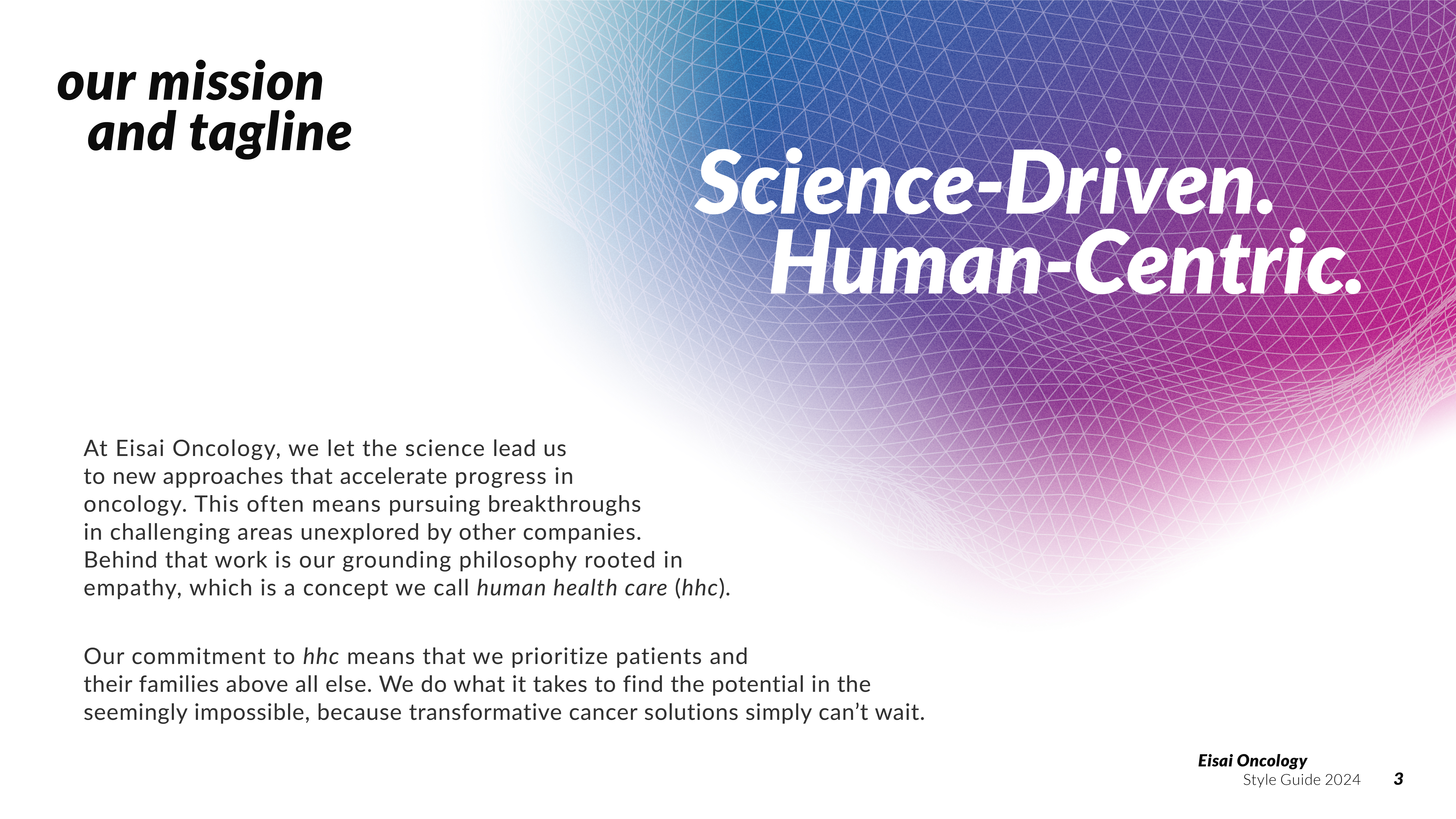
Behind everything at Eisai is the grounding philsophy of human health care (hhc)—a state of mind and work rooted in empathy. Their commitment to hhc means they prioritize patients and their families above all else, and do what it takes to find the potential in the seemingly impossible,—because transformative cancer solutions simply can’t wait.
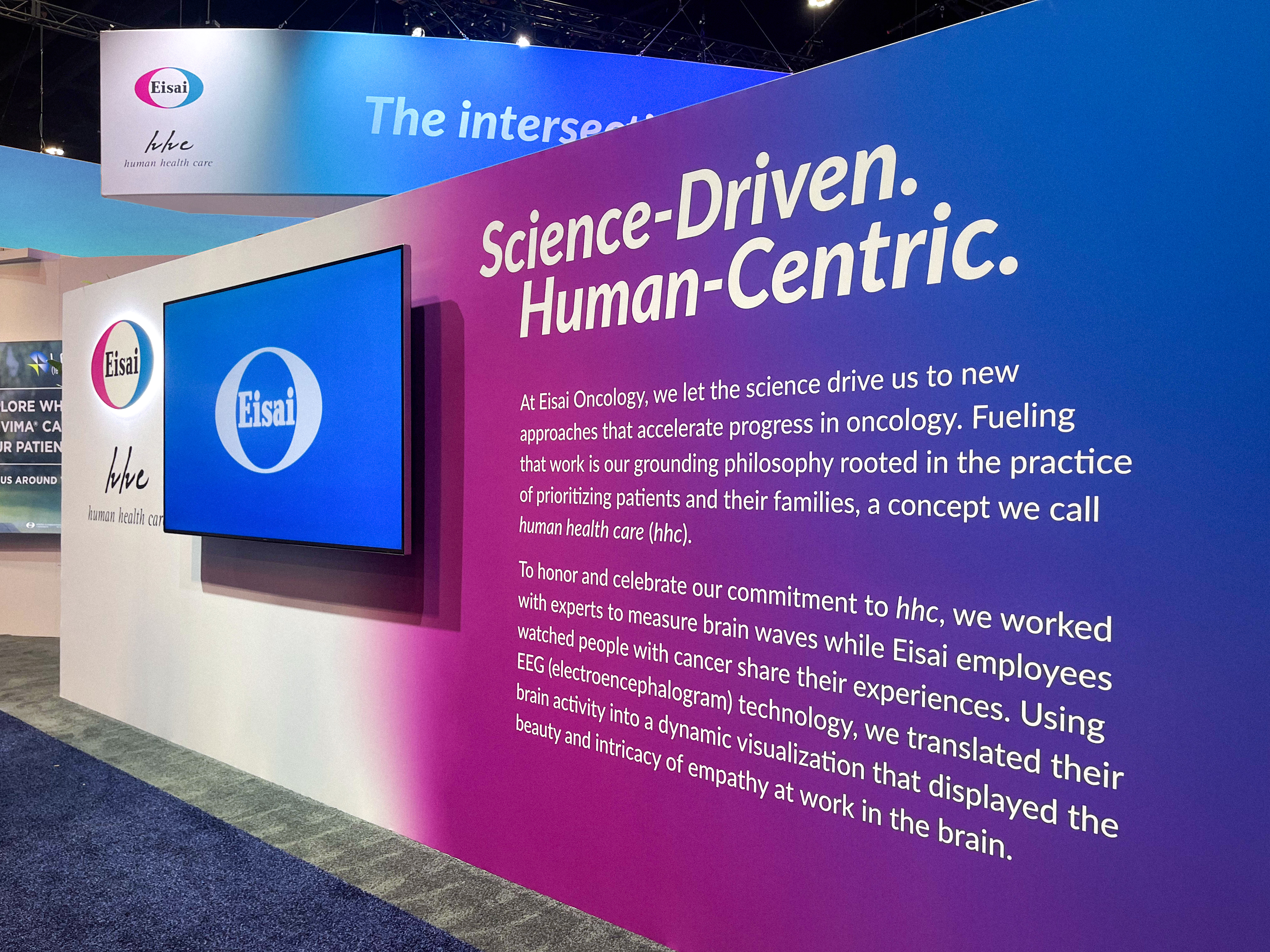
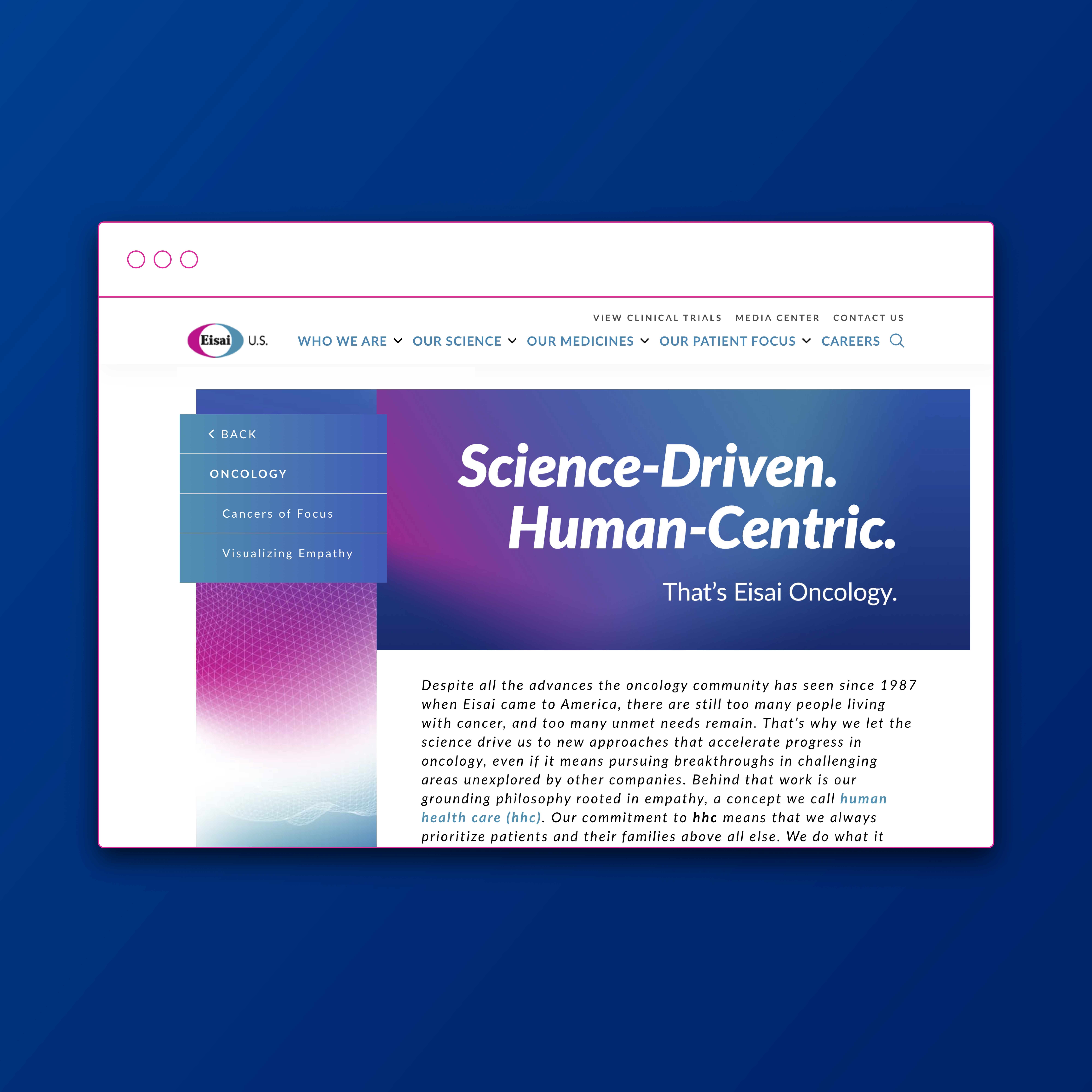
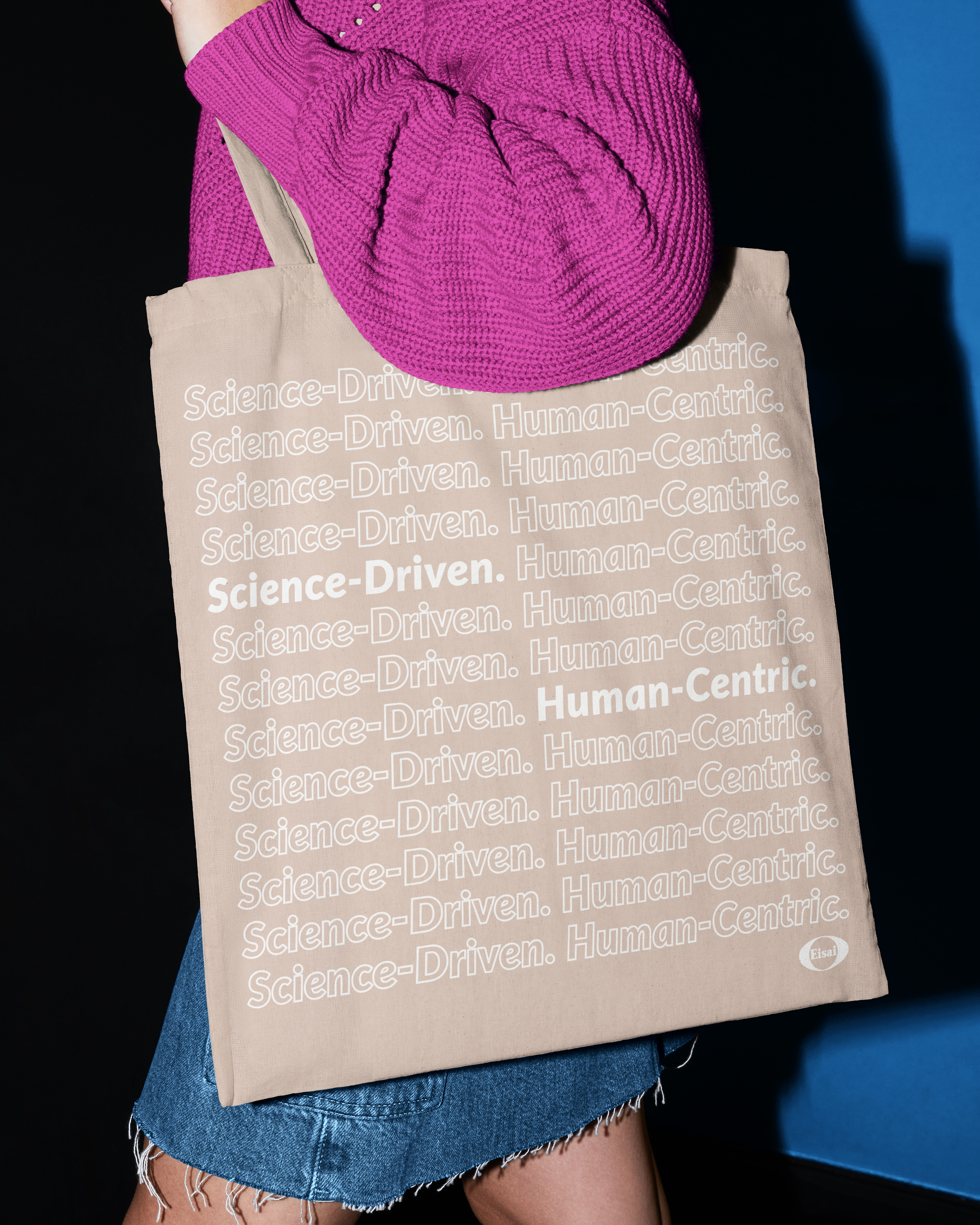
We were tasked with creating a new brand identity to pull their oncology initiatives to the forefront, and unite them under a singuler entity—and thus, Eisai Oncology was reborn. With a complete visual identity and an inaggural video, we launched Eisai Oncology back into the stratosphere of leading heathcare providers with hhc proudly at the forefront.
rooted in japanese heritage.
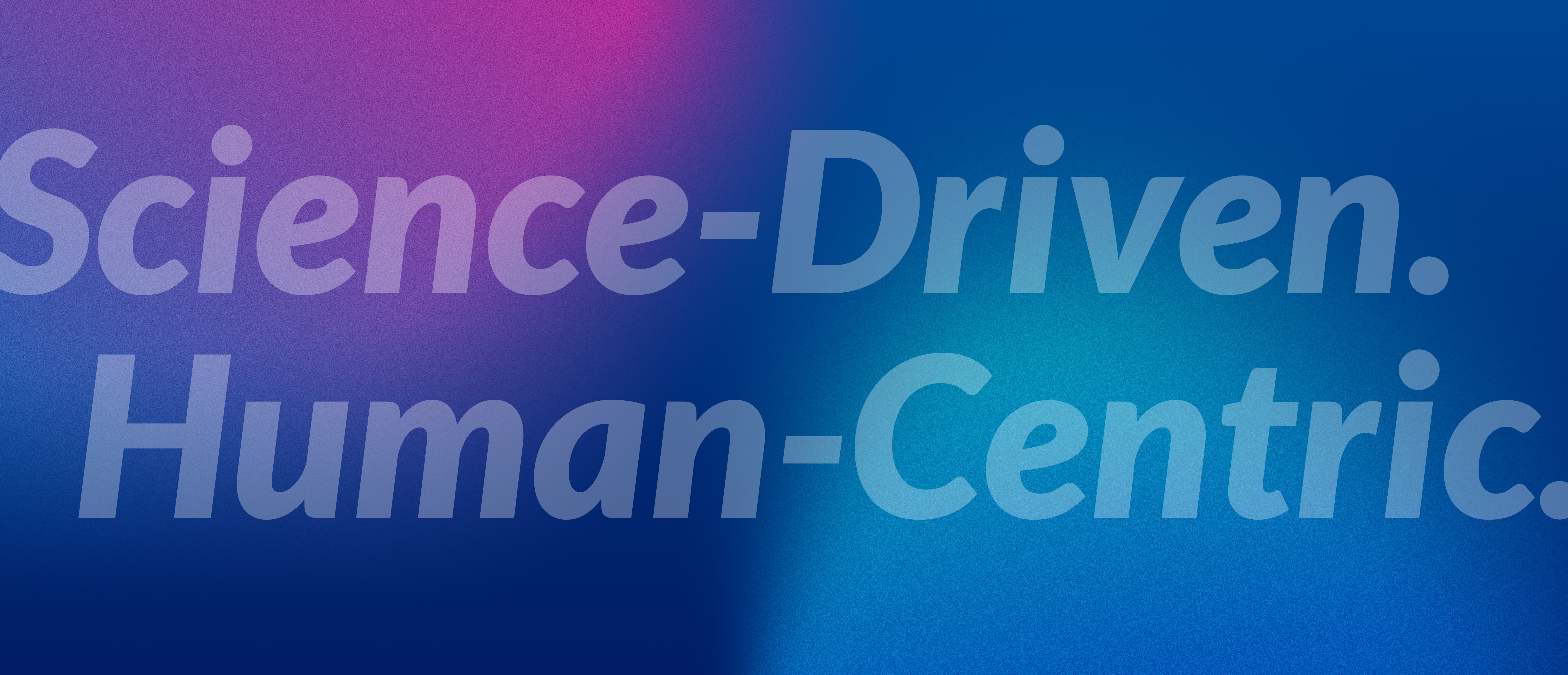
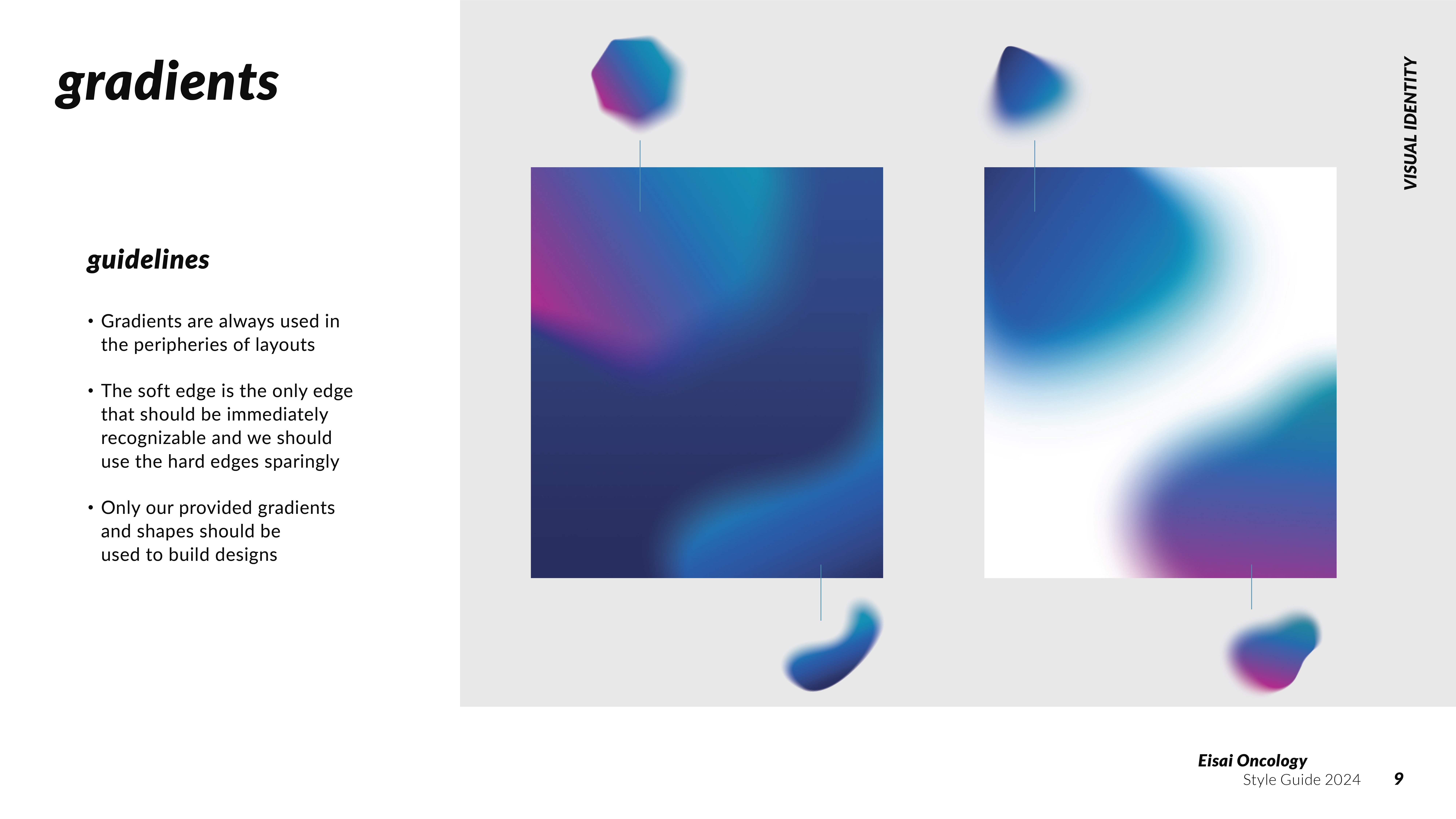
Eisai Oncology’s visual identity fuses traditional watercolor techniques with modern elements, symbolizing the juxtaposition of tradition and innovation. Like the fluid strokes of watercolor, our palette blends Eisai colors with intention. We bring these bold colors to life in a modern way, artfully using gradients to evoke the depth, vibrancy and resilience of Eisai’s unique approach to oncology.


visualizing empathy.
We worked with experts to translate brain wave activity to associated states that reflect the complex process that is empathy. Then, we used electroencephalogram technology to visualize this empathy-related activity in the brains of Eisai employees as they watched people with cancer share their experiences.
These neurologically-informed visualizations give us a unique glimpse into the beauty and intricacy of empathy at work in the brain. Our intent was to honor and celebrate what makes Eisai special: their deep sense of commitment to, and empathy for, patients and their families.
The symbolism behind these overlapping circle elements is two-fold: they represent two people connected by the empathy they share and our commitment to collaborating with others across industry and advocacy to advance progress in oncology.



Creative direction: Calina Hiriza & Austin Stone
Motion design: Hannah Rose Ryan & Austin Stone
Brand execution: Hannah Rose Ryan
Motion design: Hannah Rose Ryan & Austin Stone
Brand execution: Hannah Rose Ryan
brand identity • art direction
print production • web design
print production • web design
